As a developer, you may have been in a situation to create Image galleries/slides to showcase movies, books, etc… Most of the time these Image galleries should fit into small, medium, and large screen sizes. While you can use CSS frameworks such as Bootstrap or Materialize, with CSS Grid Layout you can create a simple responsive image gallery with few lines of code.
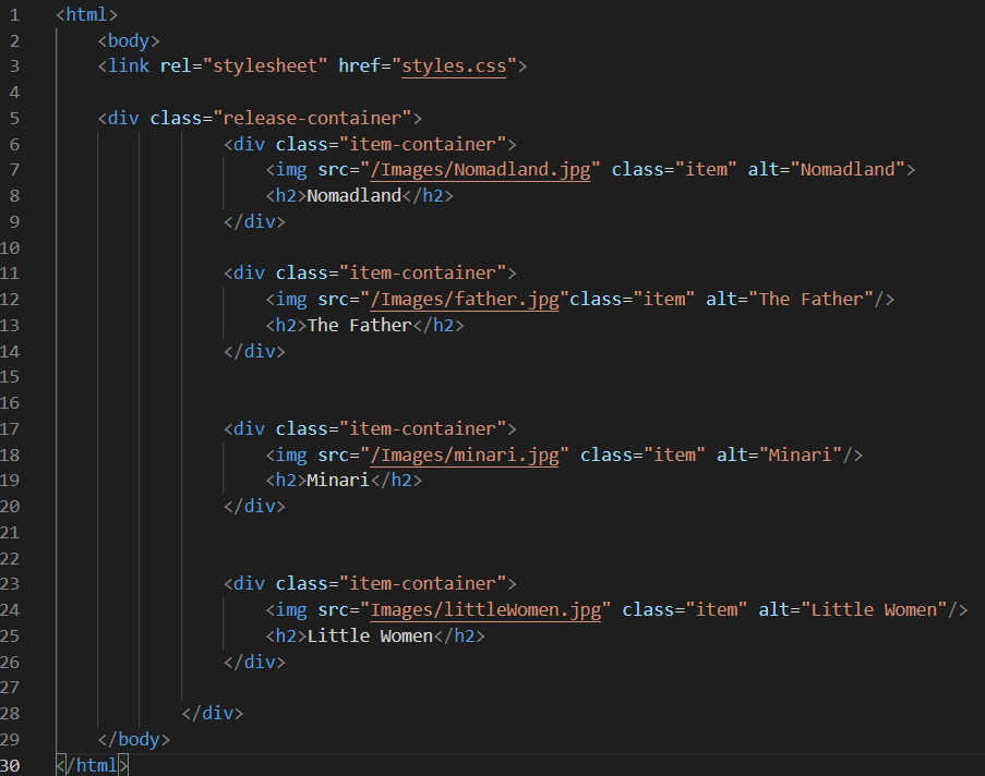
Step 1
First, create the HTML structure. I try to keep my HTML structure to as simple as I can.
Step 2
Now, create your styles.css file. This is file contains all the CSS code that is responsible for the responsive behavior of the HTML structure.
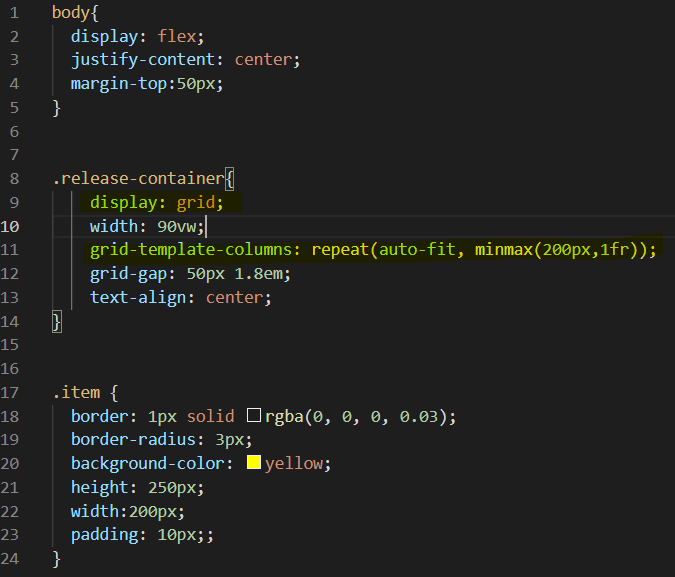
in this above css code, the part that makes responsible behavior possible is on line no: 9 and line no: 11;
therefore, provided that the images are all in the same dimensions, the extreme minimal code for the responsive behavior would be as follows:

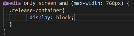
In addition. if you wish to make the images stack up on each other on a mobile screen, you may add the following media query. This will remove the grid layout, and each image will stack up as “a block” on each other on a mobile screen. I noticed that in Firefore, you do no need this block of code. Firefox automatically makes the images appear as a set of blocks.
Conclusion
Although I do not discourage you from making use of CSS frameworks, you can rely on CSS alone for making your websites responsive. This is, especially, useful in small to medium size projects. Even if you are involved in a large-scale project, you can still use Gird Layout with CSS frameworks to make your websites and web applications responsive on different platforms.