Table of Contents
What is styled-components?
In simple terms, it is a component that you can use in React applications. The purpose of the Styled- component is to create a specific HTML element and apply the CSS styles for it. As it is a component, you can use JavaScript syntax within your style component. Before you learn the basics of Styled-components, you need to have a good understanding of JavaScript, CSS, and React.
Why do you need styled-components instead of regular CSS
- Keeps a record of components being rendered and applies their styles with the least amount of code necessary.
- Generate unique class names
- when the component is deleted, the associated styles get deleted
- Simple adapting of styles of a component based on props or global theme
- Easy maintenance
- Use can use the same standard CSS you used to apply
Different ways of applying styled-components
I am going to show you how to get started with the basics of styled components by creating one of the weird-looking web pages. But, it will for sure teach you the basics so that you can start creating good-looking pages for your next app with less CSS code.
When creating styled-components, you put the HTML element ( tag ) you need to create with the associated styles of it in a template literal, which uses back quotes. Then you can assign those to a variable and use it as a React component.
The most basic way to use styled-components
import React from 'react'
import styled from 'styled-components' //import statement for Styled-components

const Wrapper =  styled.div`
    display:flex;
    flex-direction: column;
    text-align:center;
    background:lightgray;
`

function MyComponent() {
  return (
    <Wrapper>
              <h1>Styled components</h1>
                <section>
                    <Header2>Table of contents</Header2>
                </section>
             <section>
                <h2>Basics</h2>
                <li>Lesson 1<li>
                <li>Lesson 2</li>
            </section>
            <section>
                <Header2>Intermediate</Header2>
                <li>Lesson 1</li>
                <li>Lesson 2</li>
            </section>
    </Wrapper>

  )
}

export default MyComponent
Nesting in styled-components
We are going to create two style components: MyHeader for the header tag and Header2 for the h2 tag.
const MyHeader = styled.header`
    background-color: #ebfbff;
    width: 50%;
    margin: 0 25%;
}

const Header2 = styled.h2`
    color: #ac65b1;
    font-family: Inter, Avenir, Helvetica, Arial, sans-serif;
`
Let’s apply the style components.
<Wrapper>
            <MyHeader>
              <h1>Styled components</h1>
                <section>
                    <Header2>Table of contents</Header2>
                </section>
            </MyHeader>

            <section>
                <Header2 basic>Basics</Header2>
                <li>Lesson 1</li>
                <li>Lesson 2</li>
            </section>
            <section>
                <Header2>Intermediate</Header2>
                <li>Lesson 1</li>
                <li>Lesson 2</li>
            </section>
</Wrapper>
Now, what if you want to apply styles only for the h2 tag( Header2 ), which contains “Table of contents” text, inside the header tag ( MyHeader )?
you can use nesting in this situation inside the MyHeader component.
const MyHeader = styled.header`
    background-color: #ebfbff;
    width: 50%;
    margin: 0 25%;

    h2{
        color:#e18c7e;
    }
}
`
When you apply nesting, the styles you apply become localized. These styles apply only to any h2 tag inside the header tag.
Use props to modify styles
You can use props to change the styles. Following is a part of the MyComponent component. let’s say we need to apply a different color to the “Basic” header and another color to the “intermediate” header.
let’s see how we can change, based on the prop, the color of the h2 tag ( created by the Header2 component ).
First, you are going to add a prop “basic” Header component as seen below.
<section>
    <Header2 basic>Basics</Header2>
</section>
<section>
    <Header2>Intermediate</Header2>
</section>
So, how come we can access this prop( basic ) in the Header2 component?
We can use JavaScript string interpolation inside the Header2 style component.
If the prop is ‘basic’, it applies a different color, otherwise, you will have another color.
const Header2 = styled.h2`
    color: ${ props => props.basic ?  '#ac65b1' : '#6392d9' };
    font-family: Inter, Avenir, Helvetica, Arial, sans-serif;
`
Inheritance and Overriding with styled( ) constructor
When we create web pages, the elements often have the same styles, but with minor variations. In such cases, you do not need to create two CSS classes from scratch. You can use the Styled() function in a particular style component to override the styles of another style component.
let’s say we are going to create a style component for the section tag, and apply it to the MyComponent component.
const SectionOne = styled.section`
    background-color: darkgray;
    width: 50%;
    margin: 10px auto;
    border-radius: 5px;
`
<SectionOne>
<Header2>Basics</Header2>
<li>Lesson 1</li>
<li>Lesson 2</li>
</SectionOne> Now, we will have another style component with the same styles but with a different background color. You can override the SectionOne style component with the styled() function in creating this second style component( let’s name it SectionTwo ). This way SectionTwo, the will inherit all CSS values of the SectionOne component but override the value for the background-color CSS property.
const SectionTwo = styled(SectionOne)` //overiding SectionOne
    background-color: darkblue;
`
<SectionOne>
<Header2 basic>Basics</Header2>
<li>Lesson 1</li>
<li>Lesson 2</li>
</SectionOne>
<SectionTwo>
<Header2 basic>Intermediate</Header2>
<li>Lesson 1</li>
<li>Lesson 2</li>
</SectionTwo> Pseudoelements and pseudoselectors
Consider the following style component and structure. This component will create a list with <li> elements and apply the styles.
const ListItem = styled.li`
    color: #3e8744;
    padding:2px;
`
Now we can apply the component as follow inside the MyComponent component.
section>
    <Header2>Basics</Header2>
    <ListItem>Lesson 1</ListItem>
    <ListItem>Lesson 2</ListItem>
    <ListItem>Lesson 3</ListItem>
 </section>
Let’s say you want to apply a custom color for the hover effect on the list of items. For this, you need to select the <li> tag and apply : hover CSS pseudo-class
In style competent, if you want to make a reference to ALL the instances of the component, you can use & sign.
const ListItem = styled.li`
    color: #3e8744;
    padding:2px;

    &:hover{
        color:#5480d1;
    }
`
Here & refer to the li tag and applied :hover CSS Pseudo-classes. But, it is not limited to that. you can also apply other CSS Pseudo-Elements and selectors. for example, you can use & ~ & to select every <li> element that is preceded by a first <li> element in the ListItem component.
Putting everything together
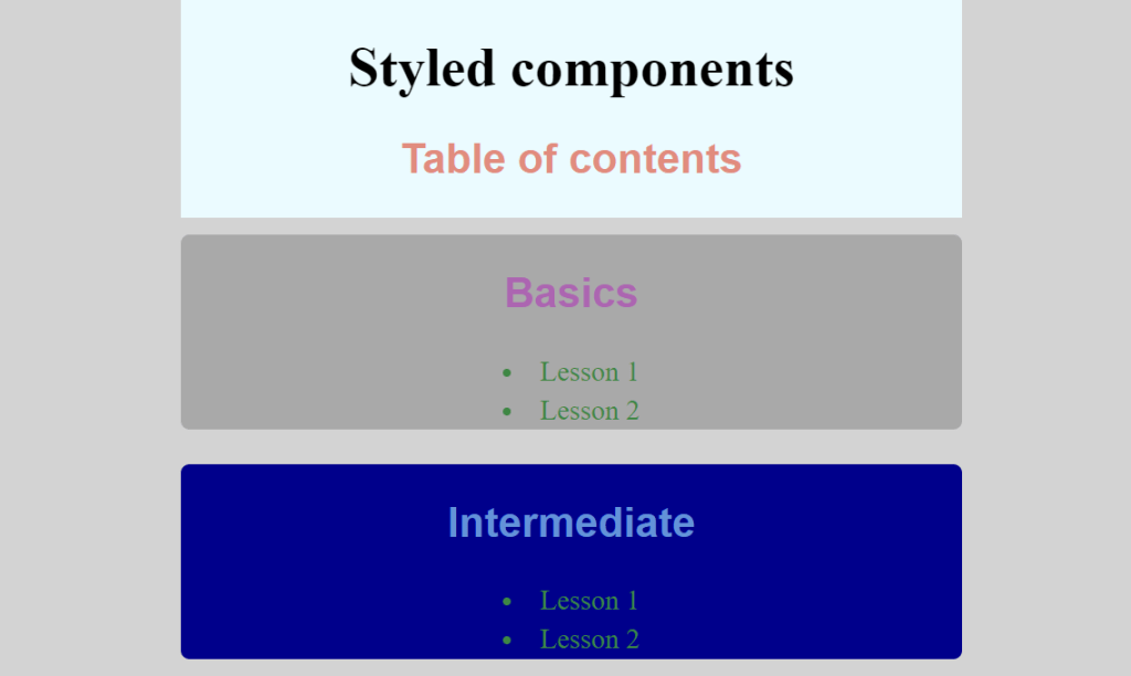
So, here is the full code in a single file. Of course, you can put the styled-components in a separate file and export it to styleComponts.jsx.
//styleComponts.jsx

import React from 'react'
import styled from 'styled-components'

function MyComponent() {
  return (
    <Wrapper>
            <MyHeader>
              <h1>Styled components</h1>
                <section>
                    <Header2>Table of contents</Header2>
                </section>
            </MyHeader>

            <SectionOne>
                <Header2 basic>Basics</Header2>
                <ListItem>Lesson 1</ListItem>
                <ListItem>Lesson 2</ListItem>
            </SectionOne>
            <SectionTwo>
                <Header2>Intermediate</Header2>
                <ListItem>Lesson 1</ListItem>
                <ListItem>Lesson 2</ListItem>
            </SectionTwo>
    </Wrapper>

  )
}

export default MyComponent

const Wrapper =  styled.div`
    display:flex;
    flex-direction: column;
    text-align:center;
    background:lightgray;
`

const MyHeader = styled.header`
    background-color: #ebfbff;
    width: 50%;
    margin: 0 25%;


    h2{
        color:#e18c7e;
    }
}
`


const Header2 = styled.h2`
    color: ${ props => props.basic ?  '#ac65b1' : '#6392d9' };
    font-family: Inter, Avenir, Helvetica, Arial, sans-serif;
`

const ListItem = styled.li`
    color: #3e8744;
    padding:2px;
`


const SectionOne = styled.section`
    background-color: darkgray;
    width: 50%;
    margin: 10px auto;
    border-radius: 5px;
`

const SectionTwo = styled(SectionOne)` //overiding SectionOne
    background-color: darkblue;
`